 There are haters of infographic resumes, and there are lovers of infographic resumes. I’m both.
I love the idea of a clean, organized display of a job applicant’s skills and accomplishments with well-designed graphics. I hate the reality that most infographic resumes are developed with no purpose in mind but to follow the trend.
The goal of an infographic resume, as with any resume, is to clearly convey a message that you’re the best candidate for the job. If that message gets lost in layers of graphics, decorative fonts and a rainbow of colors, you’re wasting your time and the time of the hiring manager — which, quite frankly, will annoy the hiring manager and not land you that much-anticipated interview or job.
When done well, infographic resumes can be a powerful statement about your creativity, communication skills, and forward thinking mindset. (Tweet this thought.)
In preparation for this article, I reviewed hundreds (probably near a thousand) infographic resumes. I only came up with three examples that I deem worthy of stellar status, and I’ll share my finds for the top three infographic resumes in just a minute.
First, let’s talk about what it takes to build a great infographic resume:
1. Visual Appeal
This is harder than you might think. It’s not about choosing your favorite colors and slapping some shapes on the page. There are actually standard principles of design, based on the the Gestalt Principles of the Unified Whole, that create an interesting and pleasing interaction with the viewer.
A skilled designer can apply these principles to create a successful visual representation of your message. If you have an overall vision and just need some help polishing it, free programs like gliffy.com or draw.io can help you outline your ideas prior to meeting with a designer.
Bottom Line: if you’re not a designer, I highly encourage you to get some professional assistance with the final design.
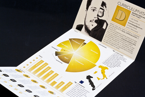
Successful Example: Daniele Degli Agli has an infographic resume that presents a well-thought-out design that’s pleasing to the eye and draws the viewer in to learn more about him. All the principles of design are used here (similarity, continuation, closure, proximity, figure/ground and symmetry/order), and it looks great!
2. Cleanliness
Looking good is one thing, but being easy to understand is even more critical.
The reason great infographics are so successful is that they’re able to take a lot of information and simplify it into a clear and concise visual message. I should probably also stop to clarify that there are many creatively designed resumes that are awesome but don’t really qualify as an infographic.
A well-designed infographic actually provides clarity of information to the viewer, simplifying the process of understanding content. If the content itself is confusing, or the display of the content is hard to follow, the message will be unsuccessful. Couple that with the fact that the purpose of a resume is to summarize your skills and experience to convince someone it’s worth speaking to you, and you have the beauty of an infographic resume.
Infographic resumes are still very new to most hiring managers. If you submit something confusing and hard to decipher, they’re not going to take the time to try to figure it out.
Bottom Line: If your resume requires a key or legend to understand it, start over.
Successful Example: Matthew Philips does an excellent job of keeping it “clean” in his “Experience” section. I can immediately see how many years he has in the industry, what his strongest skills are and where he has the most experience.
No doubt this information would have taken much longer to decipher in a paragraph of text, but now the hiring manager has a clear visual in their head when comparing his resume against others — making their job easier and Matthew more memorable.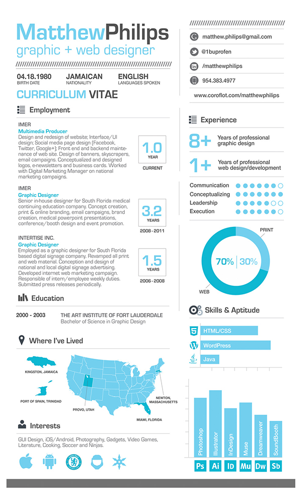
3. Substance
Beyond the graphics, your infographic resume needs some meat to it.
The easiest thing to do is start with your traditional resume (yes, you will still want to invest time into this) and highlight the key things a hiring manager will most need to know about you. Typically, that includes experience, skills and contact information, although this will vary by your field of work. Then, eliminate all the “extra” words you used to make your traditional resume sound good and think about how you can group things together to build a compelling case for hiring you.
For instance, with an infographic resume, you don’t need to create a bulleted list of your job duties at each job you’ve had. Consider grouping your skills from each job into a graph of your years of experience.
And, by all means, know your audience. Your resume, in any form, is a marketing piece for yourself. Don’t get “cutesy” with the wrong audience. This is probably one of the biggest pet peeves of infographic resume haters.
If you wouldn’t put it on a traditional resume, don’t put it on an infographic resume. You want your personality to show, but the hiring manager probably doesn’t need to know how many hours a week you like to shop or what level you’ve made it to in your favorite video game.
Bottom Line: Keep the substance of your worth but simplify the delivery.
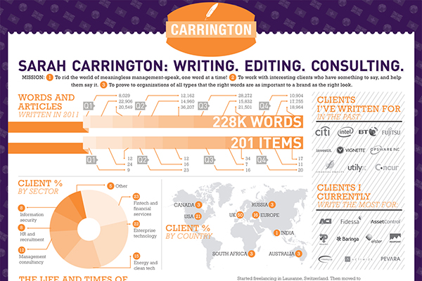
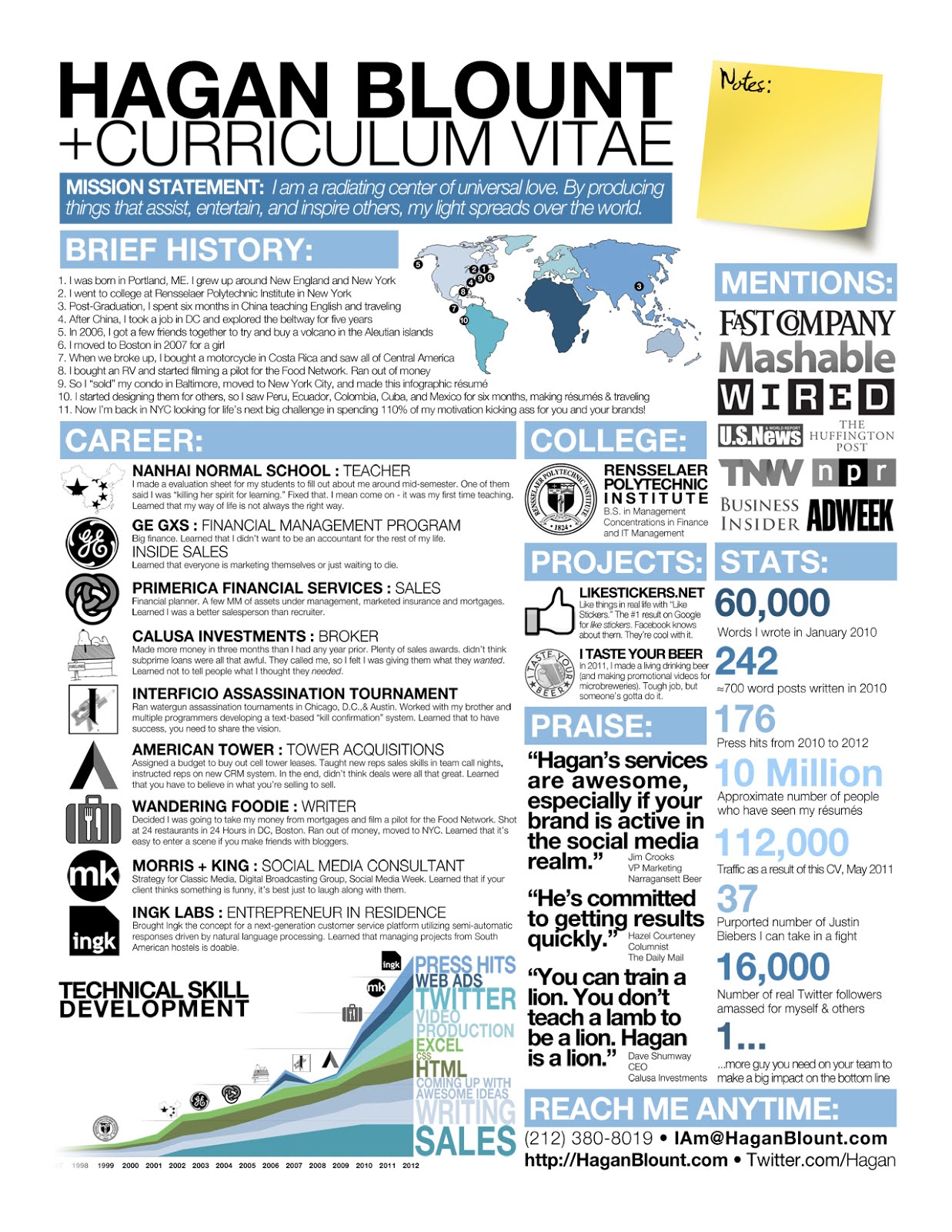
Successful Example: The top of Sarah Carrington‘s infographic resume does a great job of taking a lot of information and condensing it into a graphical depiction of substance.
In her industry, information about past clients can speak volumes about what she’s capable of and help convince a potential client she’s the one for them.
Kudos to Hagan Blount for the design.
4. Wow Factor
What’s the most important message you need to get across to your audience (typically the hiring manager, but could also be potential clients)?
Whatever that message is, it needs to be the focal point, and it needs to be conveyed in a convincing way that literally makes them say, “Wow! I need to talk to this person.”
Examples of Wow Factors:
- Timeline of accomplishments
- Statistics of your results
- ROI for clients
- Quotes from references
- Concise tagline of your expertise
- List of awards and recognitions
Think hard about what the needs of your audience are and what you could show to prove you’re the one for the job.
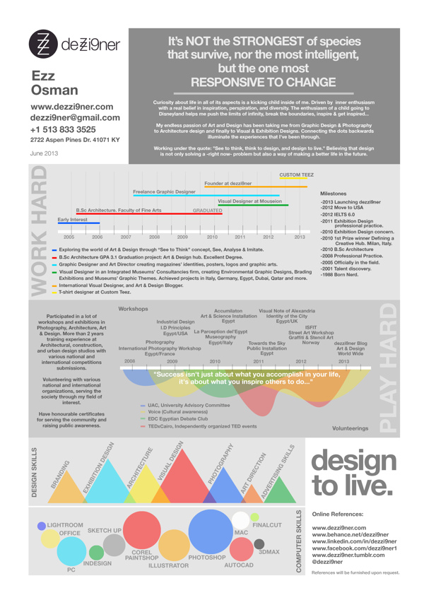
Successful Example: Ezz Osman certainly has a wow factor that makes me smirk a little. I’m not sure of his true intentions with the quote at the top, but if I were a hiring manager who had 50 qualified but traditional resumes on my desk and Ezz’s infographic resume with this quote, it would (almost) seal the deal for me before even reading on.
He’s telling the reader that in order to make it in this crazy economy, you’re going to have to adapt and think outside the box — and he’s proving he’s capable of it being the one to help you do it. Bravo, Ezz!
Who Should Create an Infographic Resume
You’ve probably made note that the above examples are all from people in creative fields. Does that mean that only creatives can benefit from an infographic resume? Not necessarily, but you do need to keep your audience in mind.
If your industry is very traditional, you may come up against more resistance to this type of change-up in the hiring process. Typically, creative fields are just more receptive to thinking outside the box.
Essentially, if an infographic makes it easier for you to describe your talents and paints a clearer picture of your experience or level of expertise, then by all means, go for it.
If you just think it’s a great way to get attention and just want to be different, your results probably won’t be effective, so don’t bother.
The Best of the Best Infographic Resumes
These three examples clearly demonstrate an anatomically correct infographic resume. They look good, are easy to decipher, share quality information, and they each have their own unique wow factor.
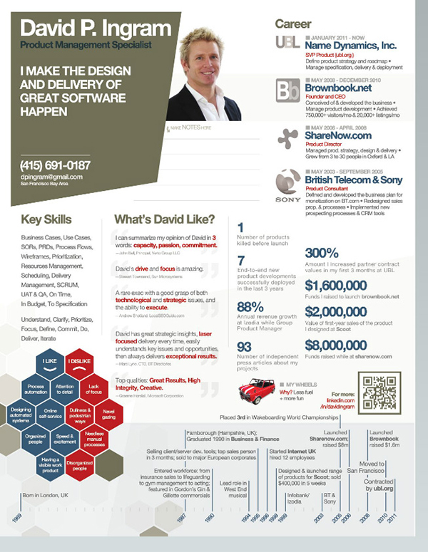
1. David Ingram
David Ingram has a clearly stated tag line and then backs it up with the content on the rest of the page. References and statistics are also used very well in this example. And I love the subtle notes area.
Kudos to Jason Orr for the design.
2. Hagan Blount
Hagan Blount seems to be leading the pack in designing superior infographic resumes, so would there be any question that his own gets star status?
I have to say he crammed a lot of content on the page, but he still makes it look good and delivers a clear picture of his accomplishments. Stellar.
3. Whitney Braunstein
My favorite part of this example from Whitney Braunstein is her “Numbers” section. This kind of data will make any employer swoon over you; proving your value as an employee in tangible statistics is an excellent use of an infographic resume.
Kudos to Hagan Blount, yet again, for the design.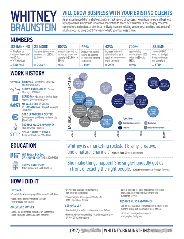
Looking to Test the Waters with Your Own Infographic Resume?
Here are a few online options for building a template-based or design-aided infographic resume:
- vizify.com (acquired by Yahoo)
- visual.ly
- re.vu
- kinzaa.com
Keep in mind that, while easy to produce, templates don’t often produce the best results for truly sharing your unique message and personality. But they can still be interesting to try out and might give you some ideas of what you’ll need when coming up with your own unique design.
Would you consider creating an infographic resume? Why or why not?


Image: Flickr
